
Client work
AMA
American Marketing Association.
Over two and a half years I went from member to the person shaping the chapter's look. I grew its Instagram, won its T-shirt competition and owned its visual identity, from the brand guide to posters and the website.
One chapter, three roles.
The American Marketing Association's Illinois State chapter connects business students with the marketing industry through meetings, speakers and events. I joined as a member, then took over its communication and, later, its brand.
- Oct 2023 – Present Member Won the 2024–25 T-shirt competition by majority vote.
- Dec 2024 – Dec 2025 Chief of Communication Launched @amaillinoisstate, designed posts and stories, and partnered with Women in Business and Red Bull on content.
- Dec 2025 – Apr 2026 Brand Manager Owned the chapter's visual identity, designed posters and handouts for every division, and worked with Communications on recruitment advertising.
- Brand systems
- Apparel design
- Print & layout
- Social content
- Web design
- Cross-team collaboration
One look across every division.
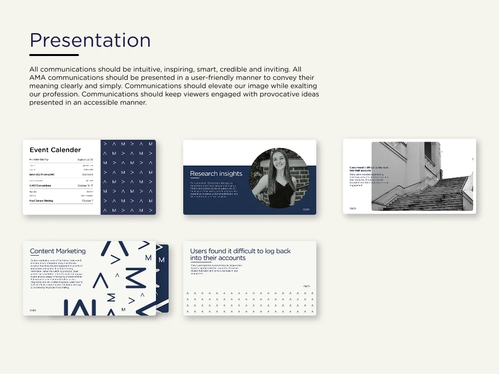
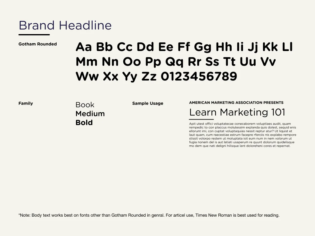
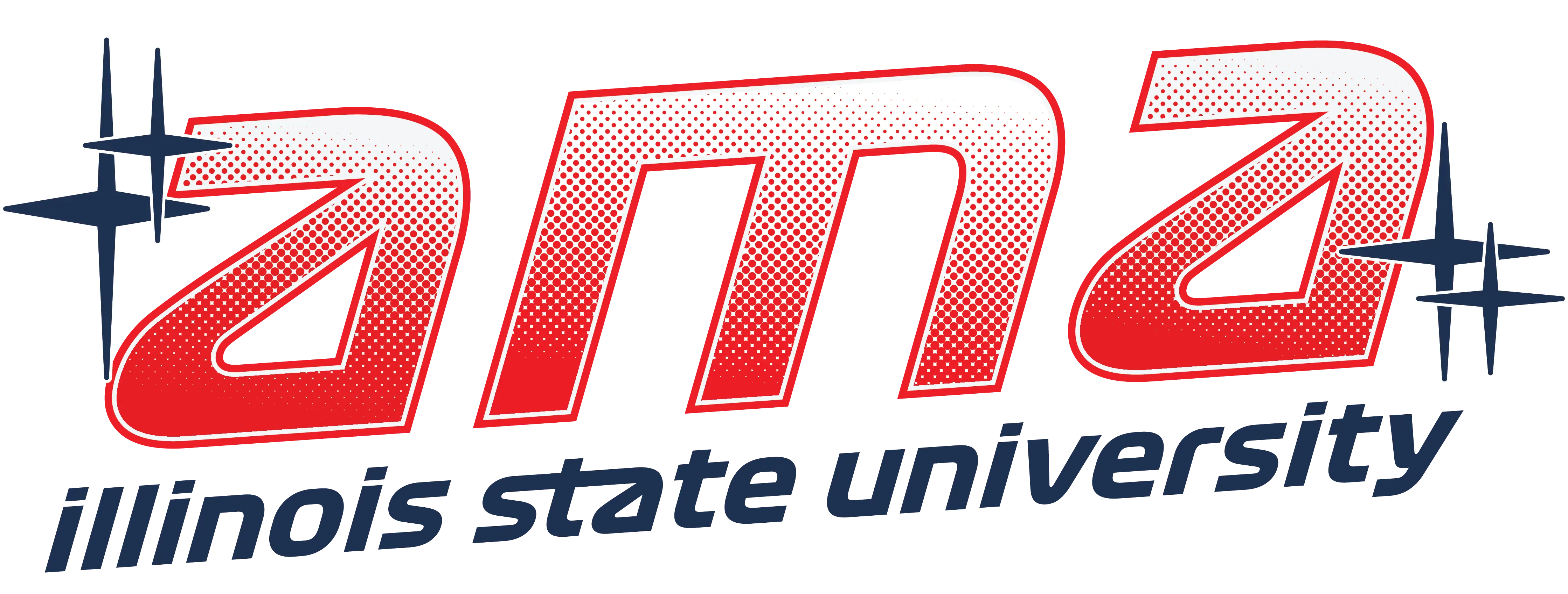
As Brand Manager I made sure every chapter material reflects a consistent, professional brand. I wrote the chapter's Brand Bible so everyone designs from the same rules: how communications should feel, which graphic elements to use, and how type is set.
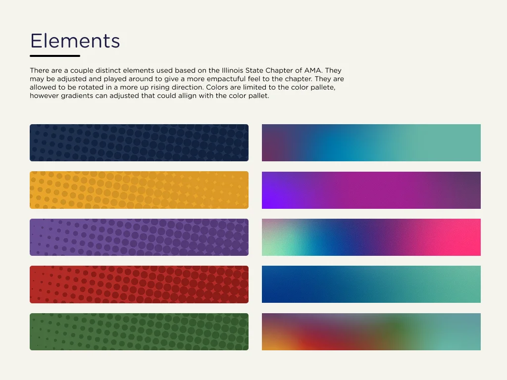
It pairs Gotham Rounded for headlines with halftone textures and gradients built from the chapter's palette.
#B22B25#1F2F4E#000000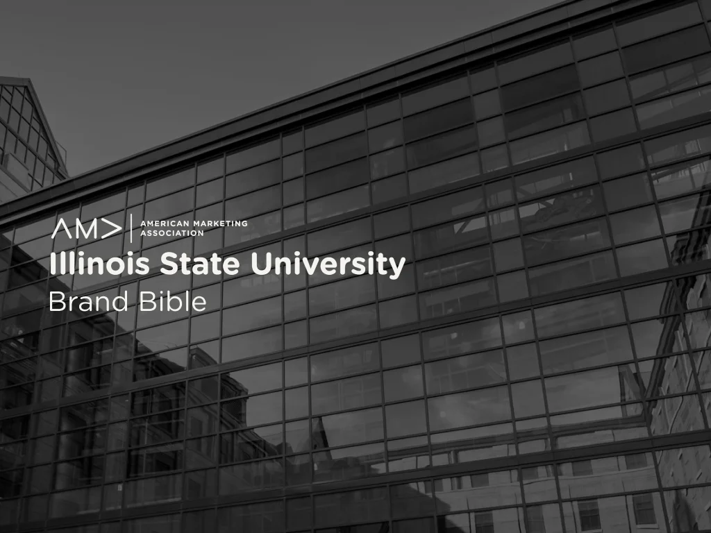
Merch people actually wear.
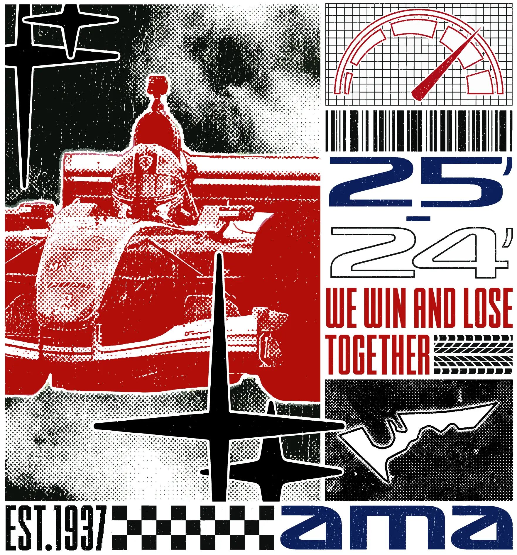
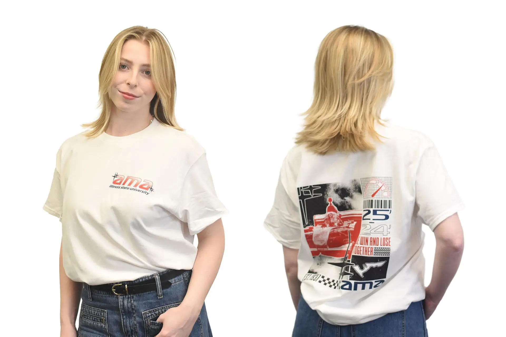
The year's theme was Formula 1. I built a collage of racing elements that also reflects the chapter: a racing-style wordmark, a checkered "EST. 1937" strip, and "We win and lose together" for the 2024–25 season.
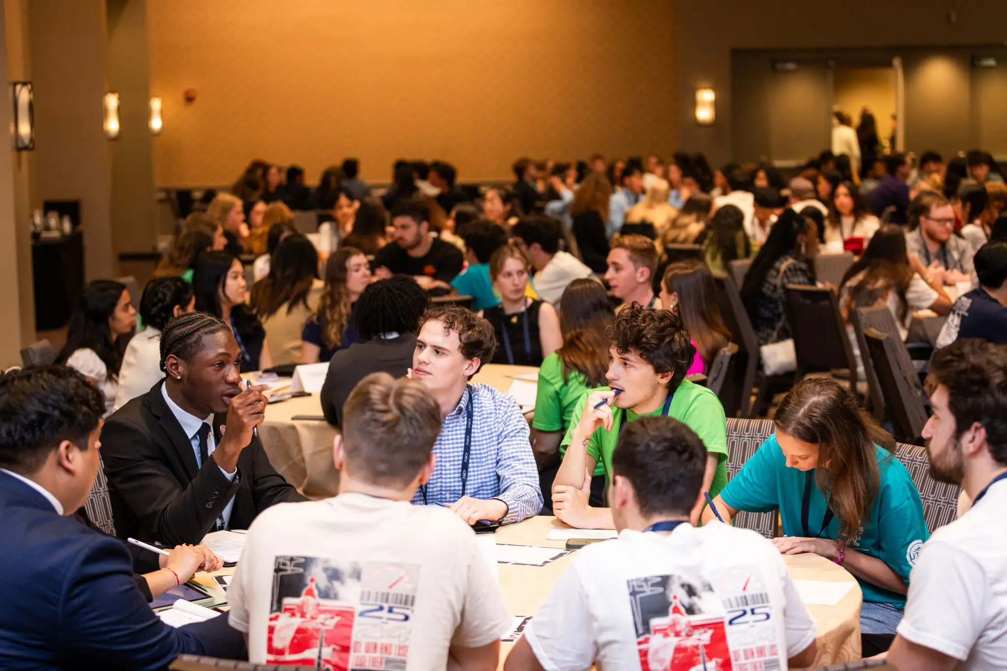
The brief I set for myself: a shirt you'd wear casually that still quietly promotes the chapter. It won the competition by majority vote, and members still wear it outside of meetings.
Straight to the point.
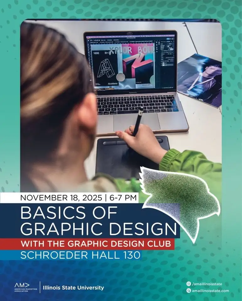
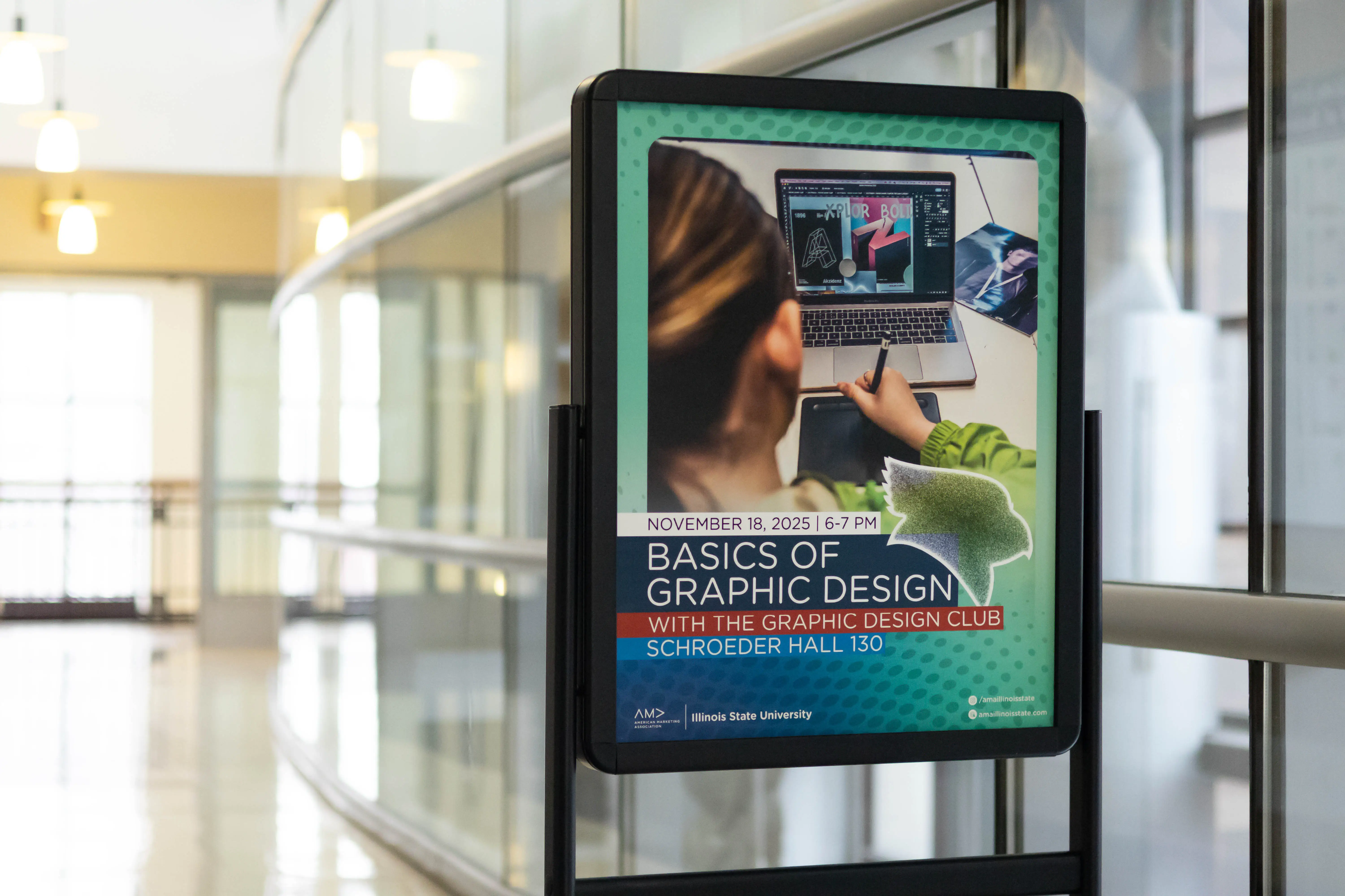
Meeting announcements that say only what students need: the topic, the date and the place. The halftone texture is a visual the chapter uses often, a nod to its unity. This one promoted "Basics of Graphic Design" with the Graphic Design Club on November 18, 2025.
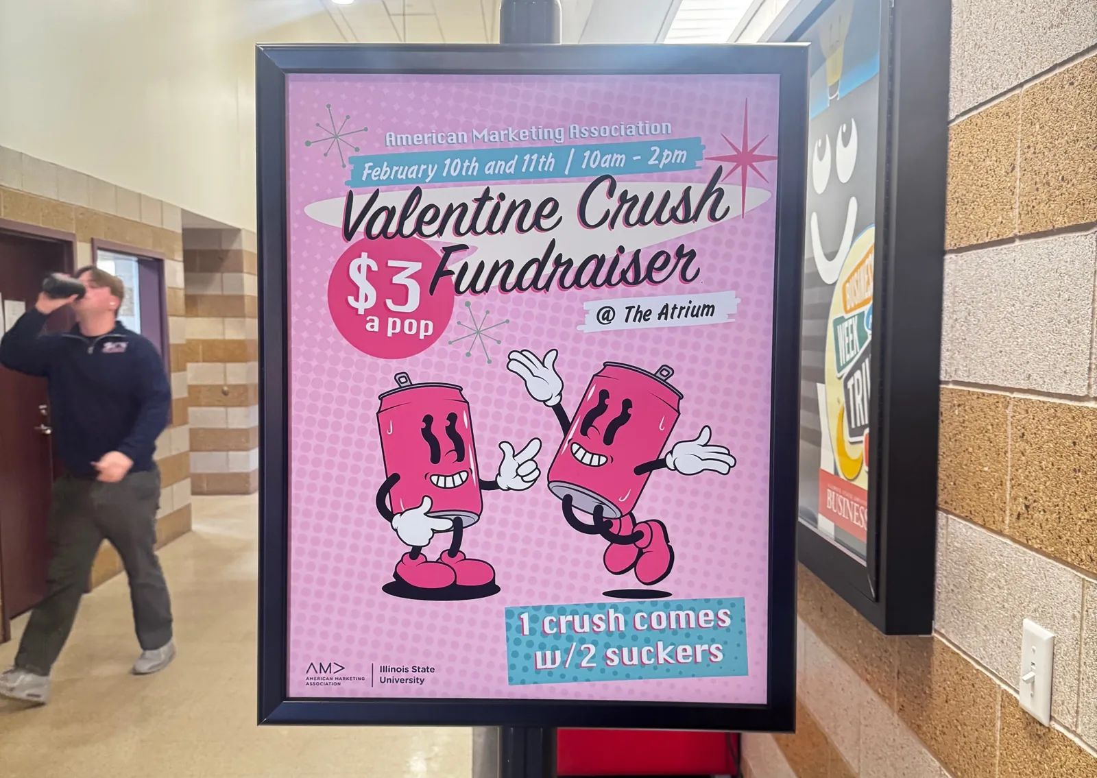
For the Valentine Crush fundraiser I went playful: retro script, halftone dots and two cartoon Crush cans, with the price and the deal (one Crush comes with two suckers) easy to read from down the hall.
The chapter's home online.
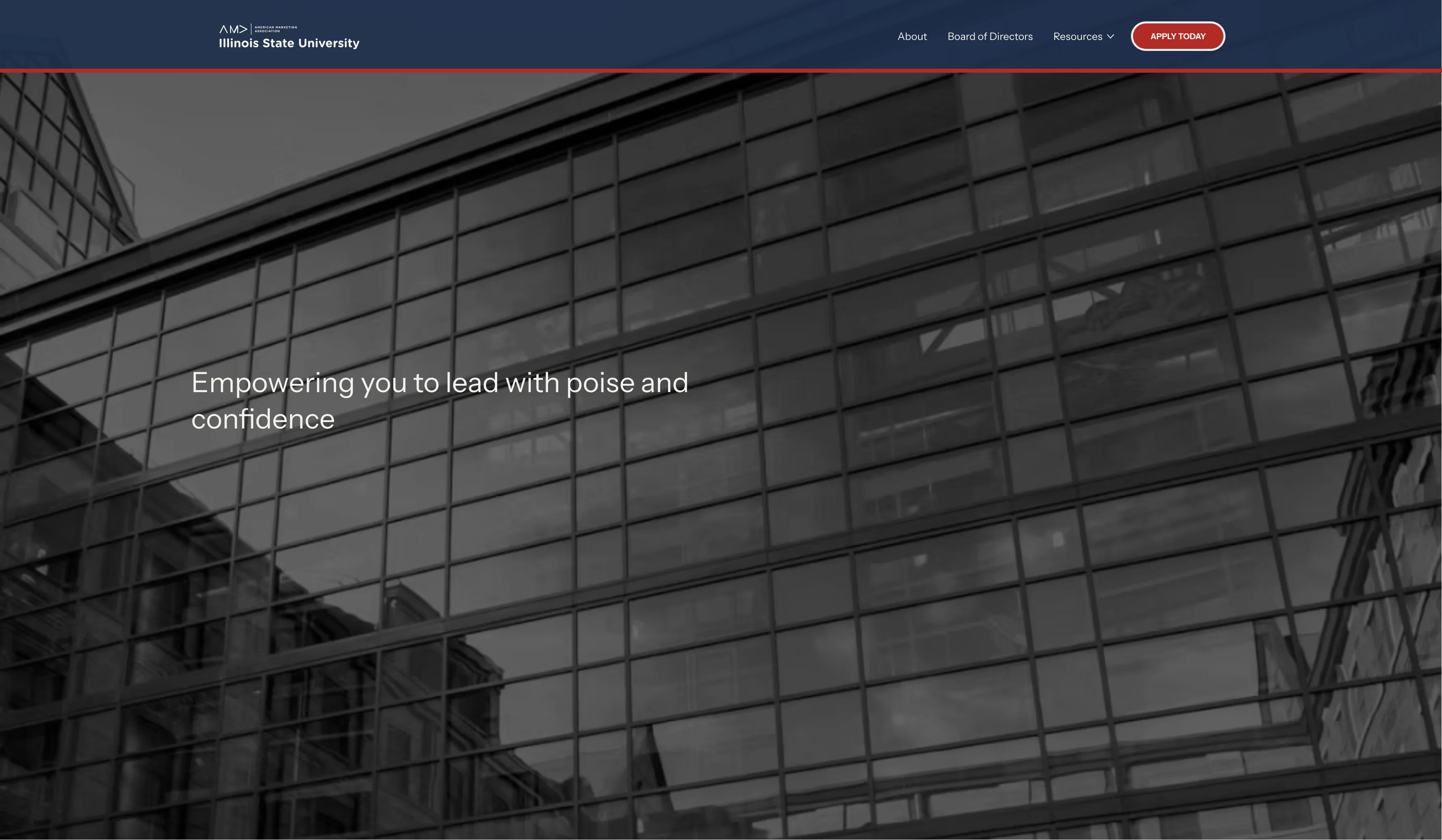
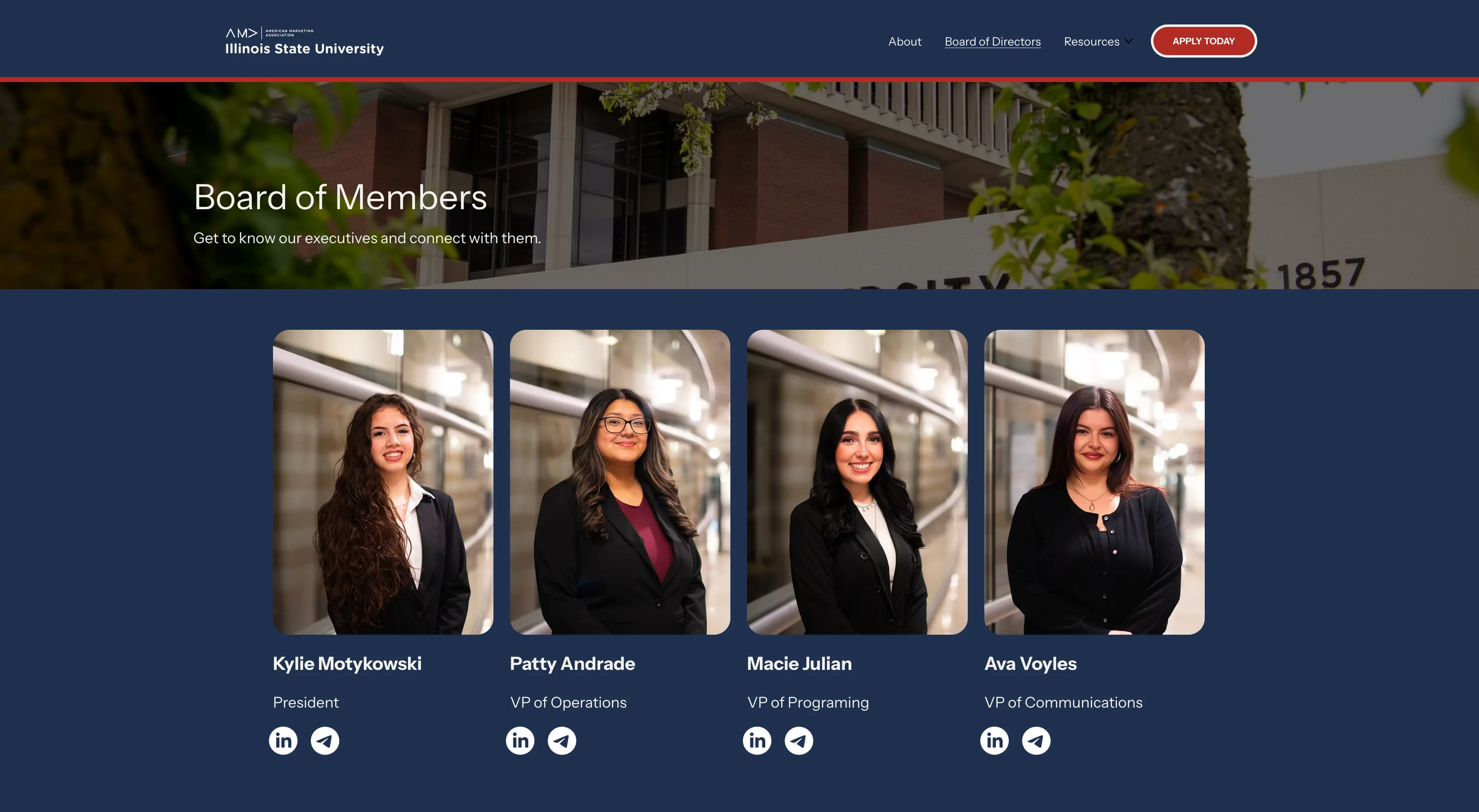
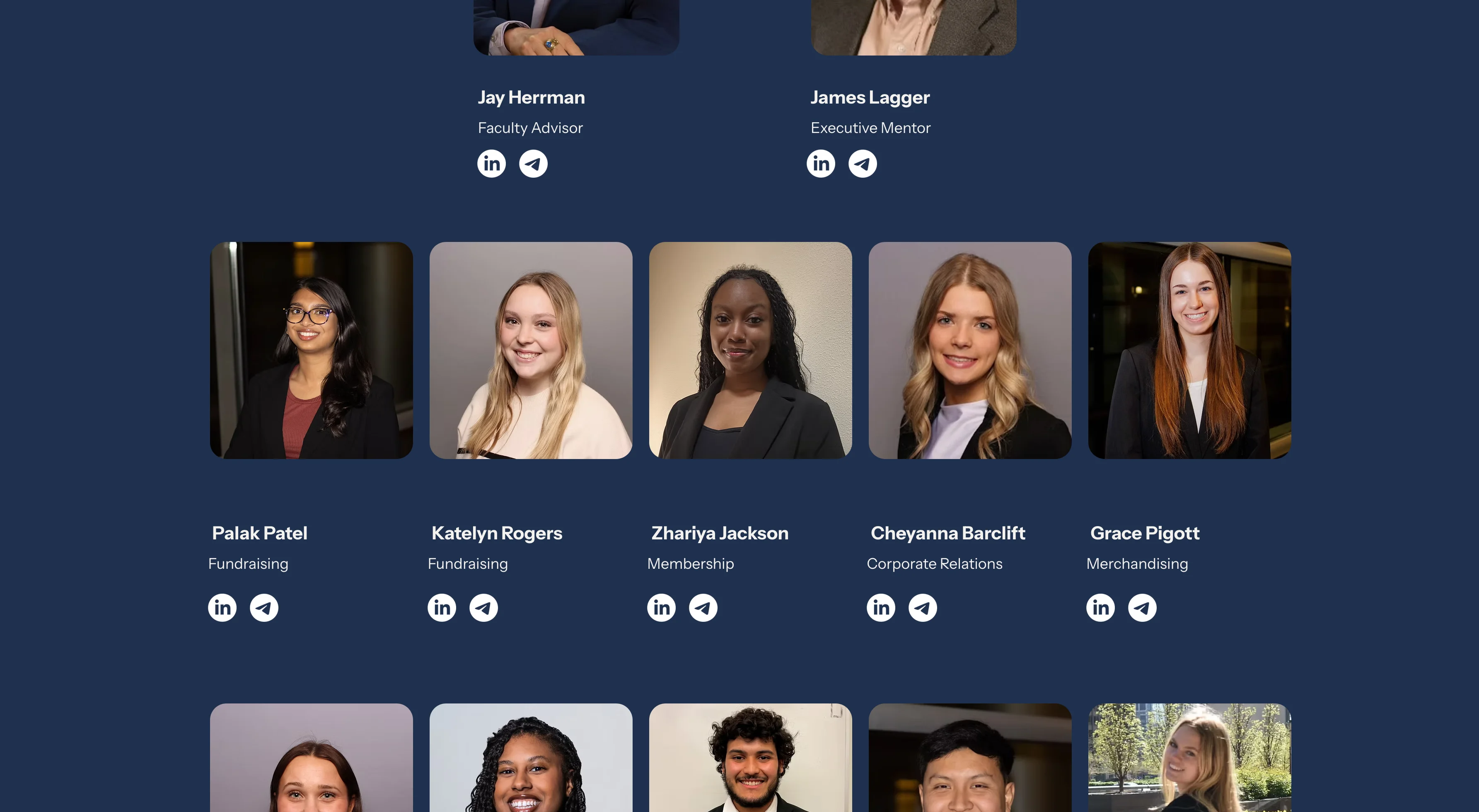
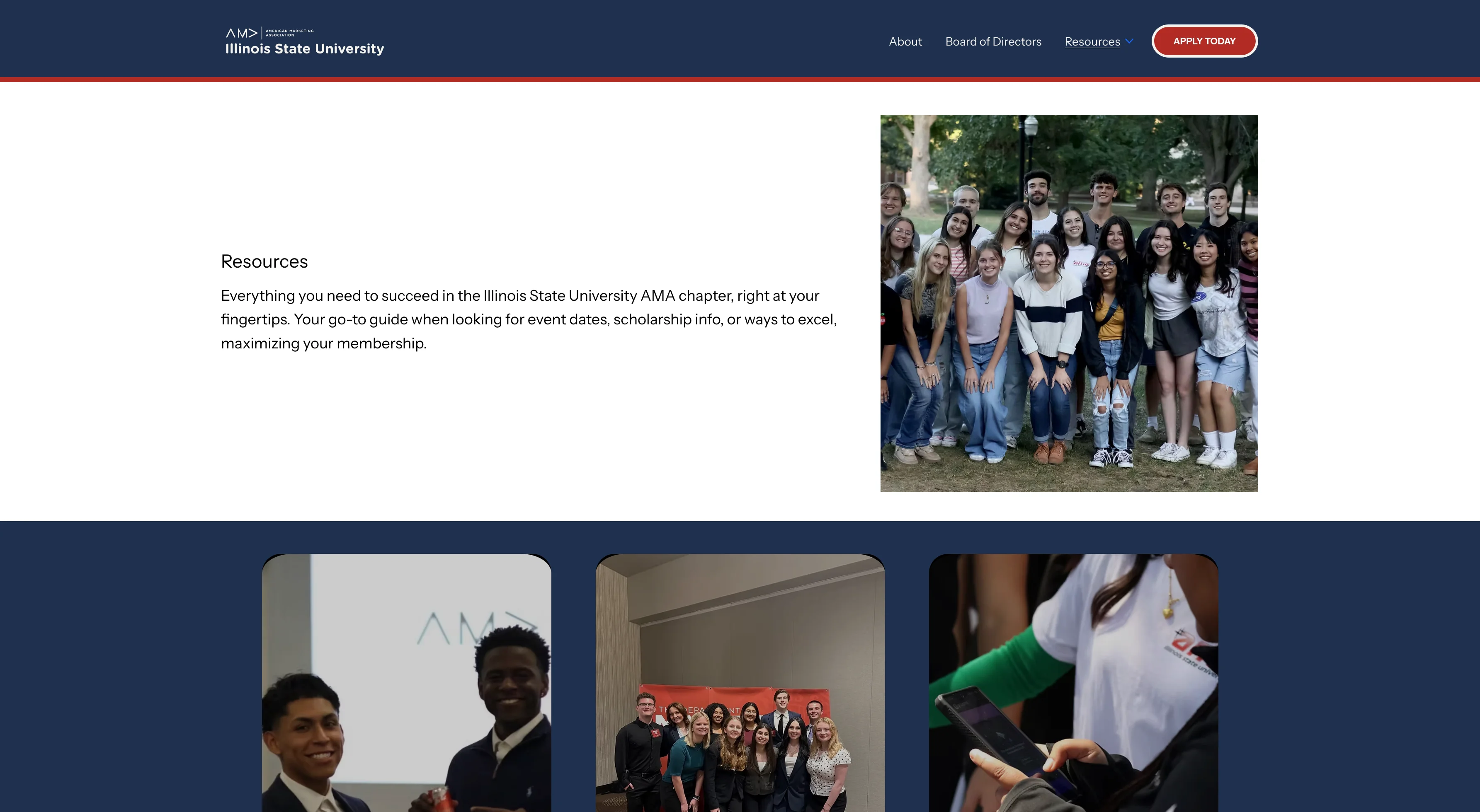
The website I designed and built for the chapter, in its navy and red. The home page opens with "Empowering you to lead with poise and confidence," a Board of Members page introduces every officer with their role and links, and a Resources page gathers event dates and scholarship info for members. An Apply Today button stays in the navigation on every page.
A system that outlasted my term.
After I stepped down, the chapter's 2026–27 social media directors kept designing from the Brand Bible: the halftone dot texture, the navy and blue gradients, and the AMA | Illinois State University lockup. These posts are their work, not mine. I'm showing them because a brand system is only as good as how well other people can use it.
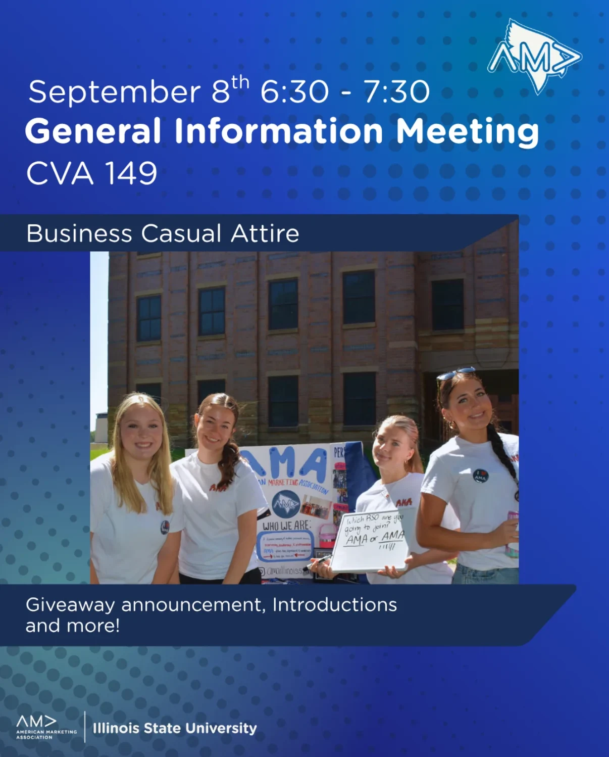
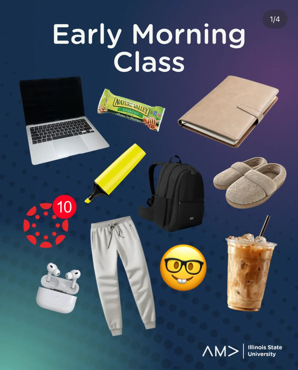
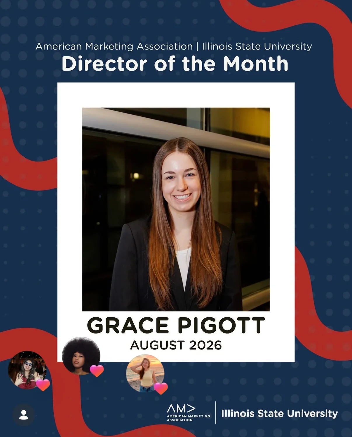
Designed by AMA Illinois State's 2026–27 social media directors, using the brand guide I created.
Building @amaillinoisstate.
I launched the chapter's Instagram and designed the graphics and stories that promote events, highlight members and build community. I tracked how posts performed to sharpen our strategy, and reached up to 60k viewers across campus.