
Gamma Phi Circus
Rebrand.
A formal, nostalgic identity for Illinois State's collegiate circus as it approaches its 100th anniversary: a new logo, type, color system, and a set of printed applications.
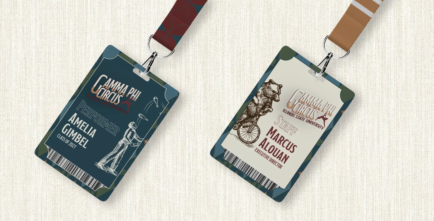
A century of thick and thin.
The organization has gone through thick and thin, from its first shutdown during WWII and coming back, to the pandemic in 2021 with its first nationwide livestream performance.
With its 100th anniversary approaching, Gamma Phi is looking for a fresh new look. My goal was to create a formal and nostalgic look for our collegiate organization, helping it stand out while looking back on many iconic circus groups.
- 01Logo
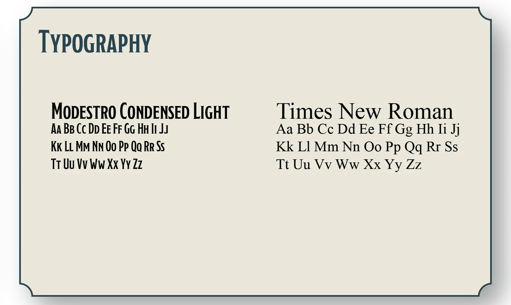
- 02Typography
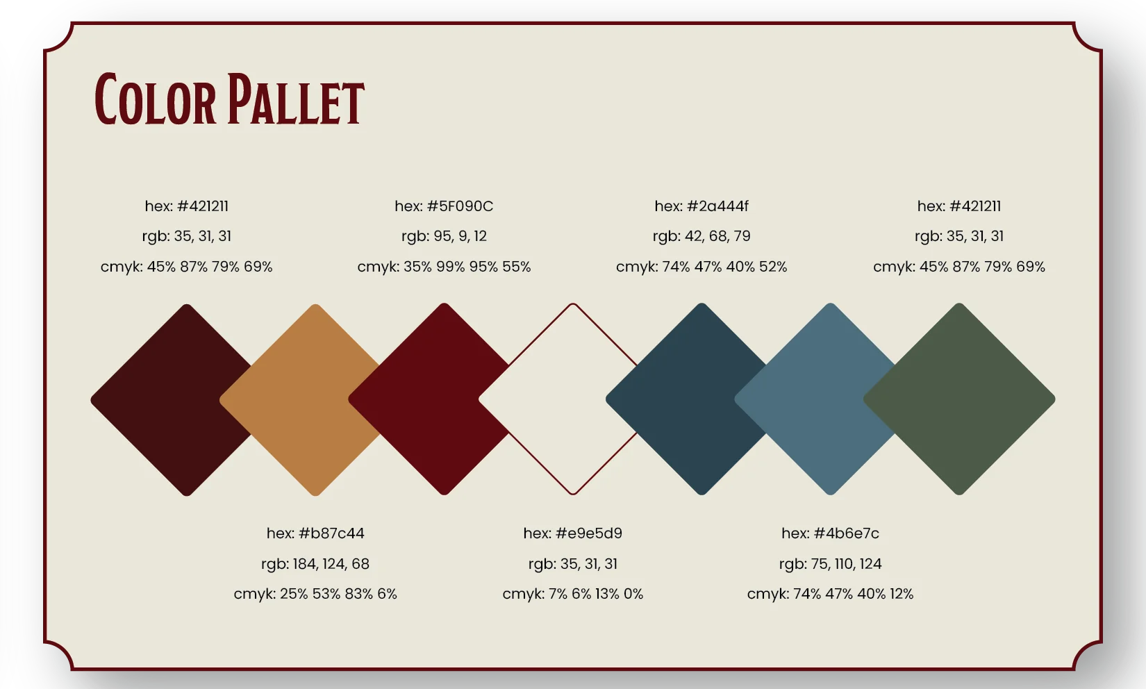
- 03Color palette
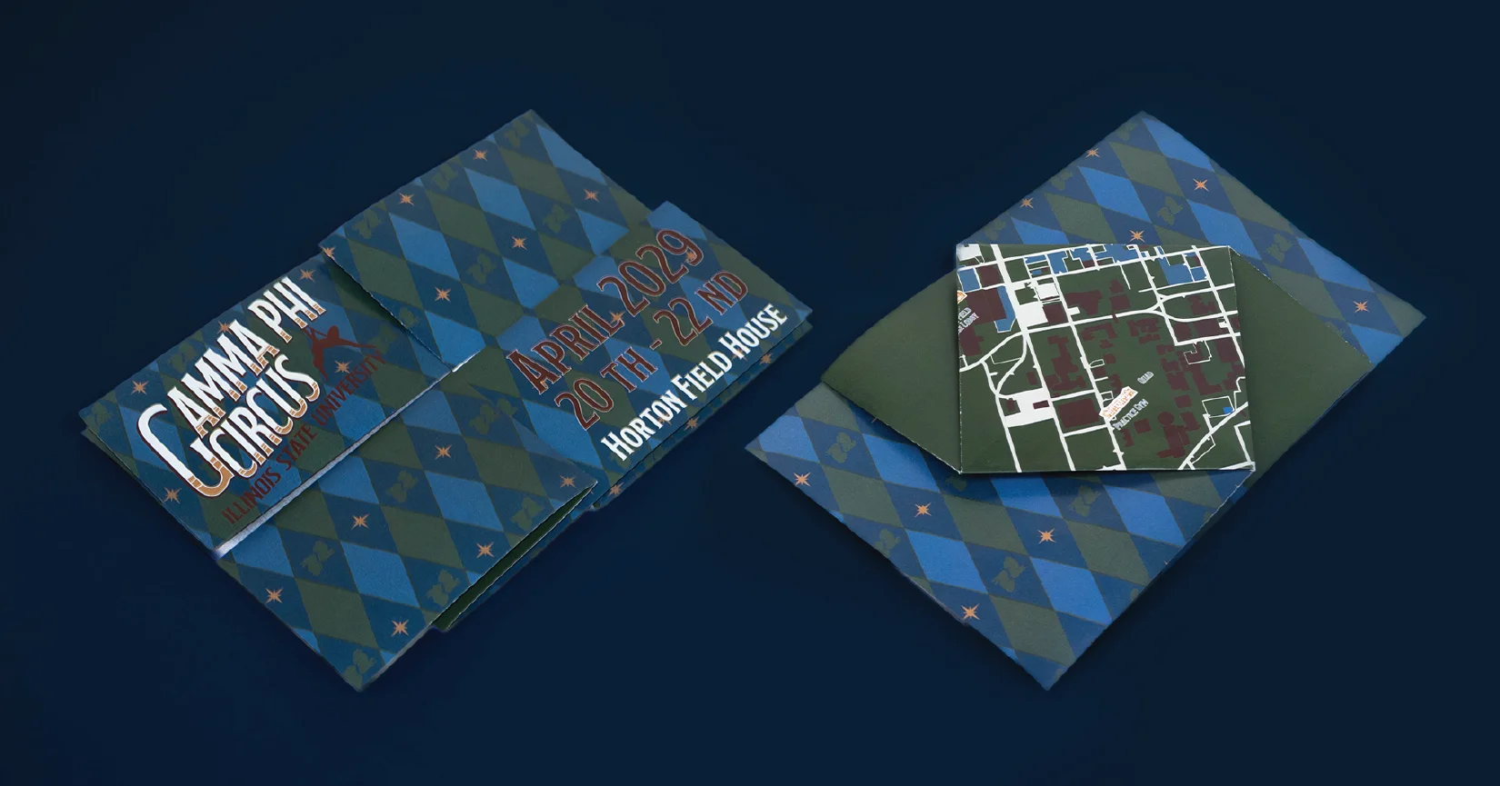
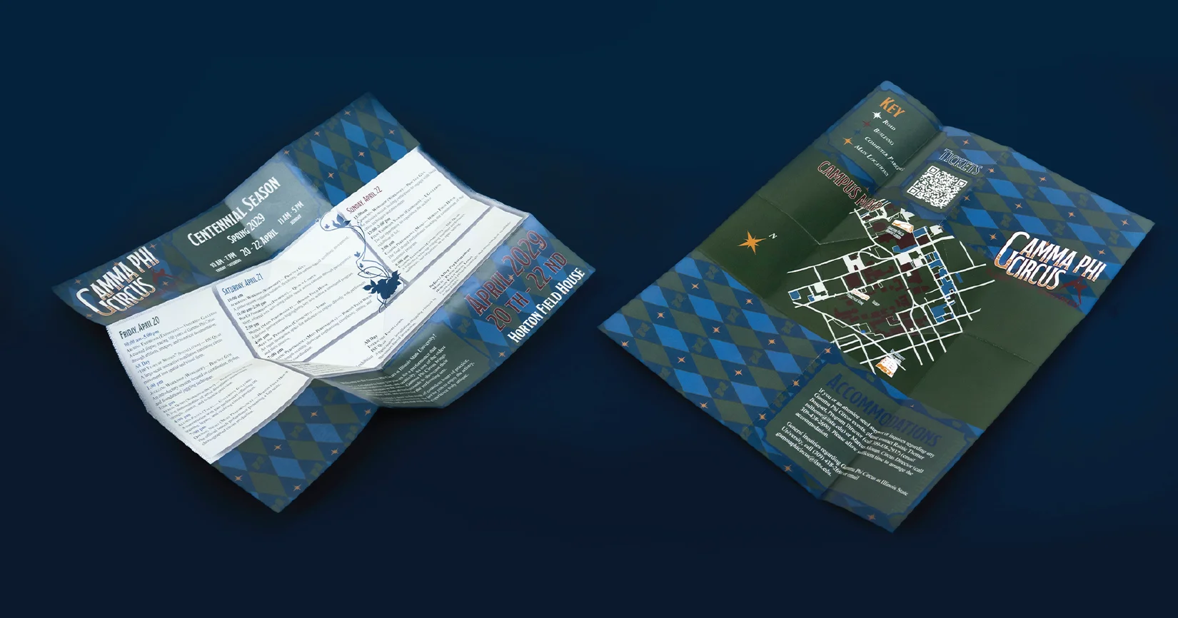
- 04Tri-fold brochure
- 05Event badges
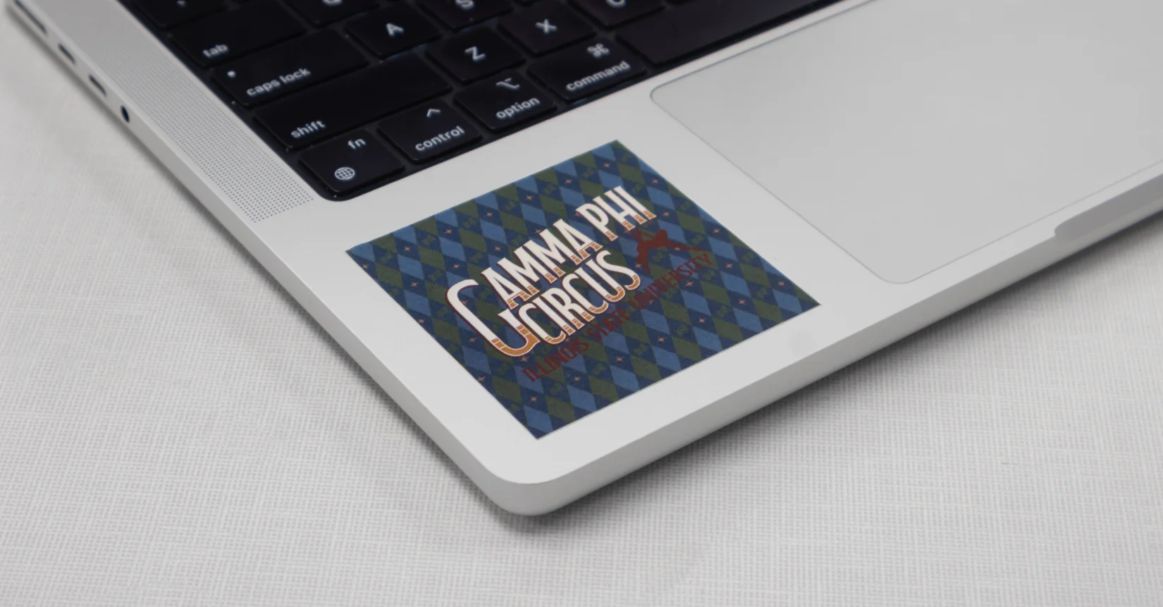
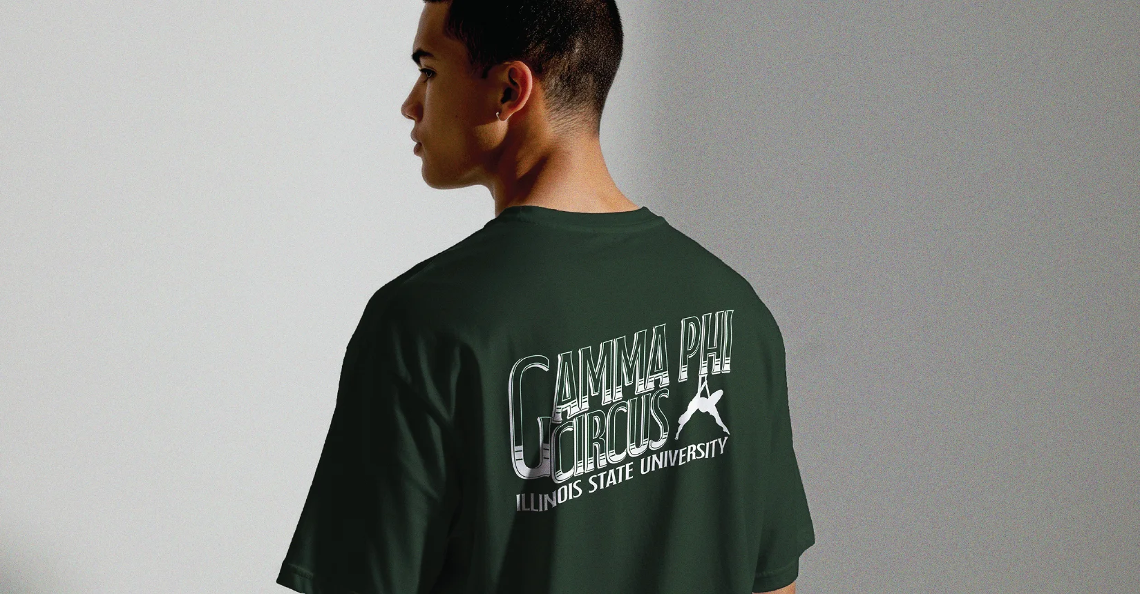
- 06Merch & stickers
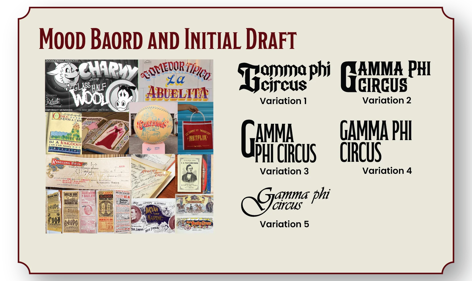
Looking back at iconic circus groups.
The mood board pulls from vintage circus posters, signage and packaging, and sits next to five early directions for the wordmark.
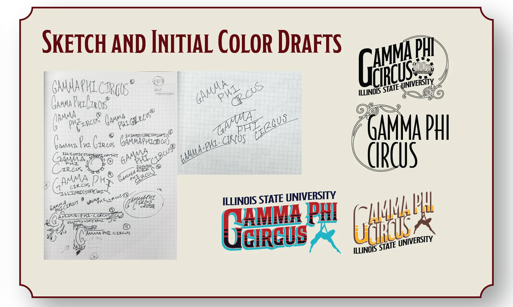
From pencil to color.
Hand sketches of the wordmark, and the first color drafts that came from them.
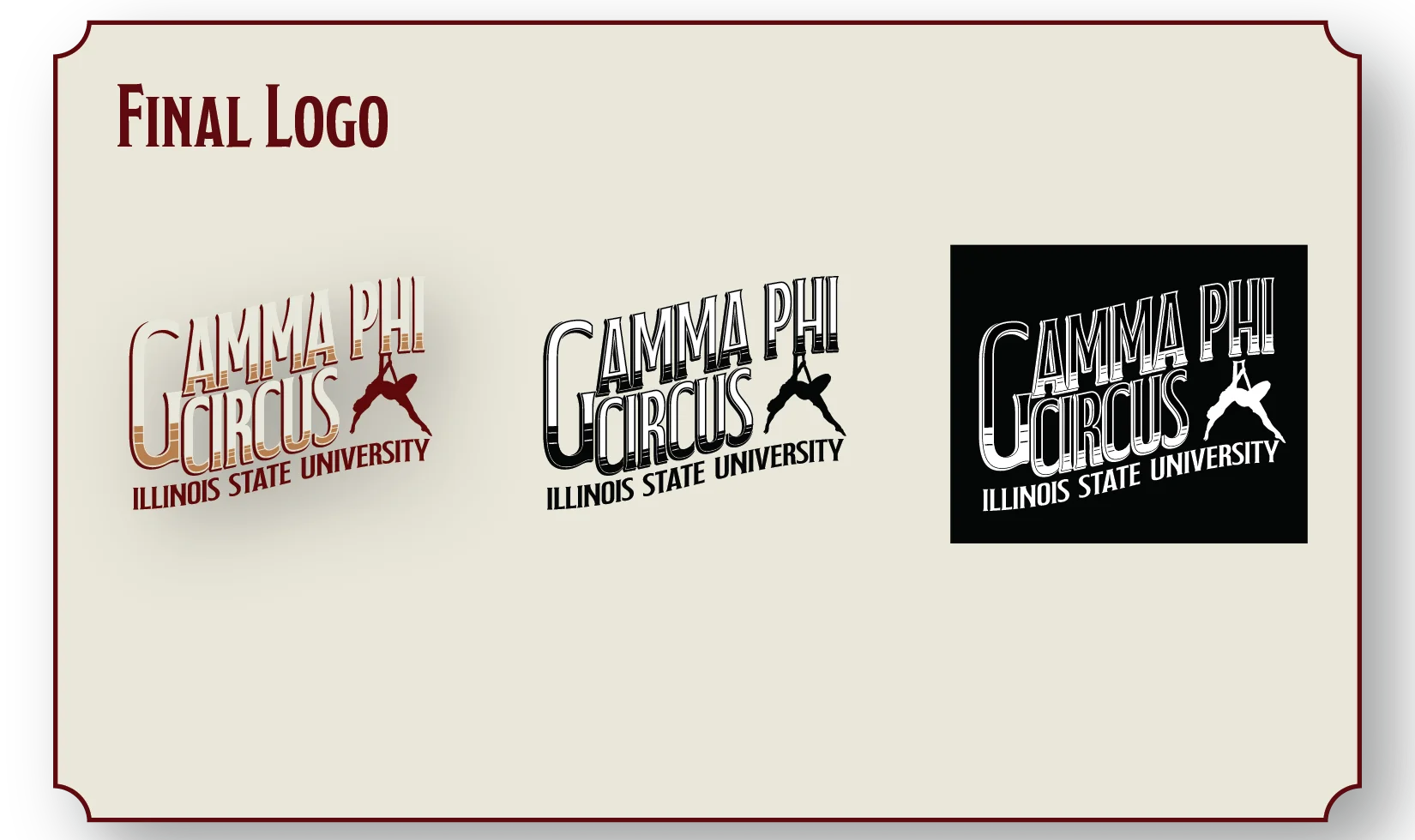
The final mark.
The final logo in its copper, dark green, and white-on-black versions.
A formal, nostalgic system.
Modestro Condensed Light for headlines, paired with Times New Roman, and a palette of deep maroons, copper, cream, navy, slate blue and olive green.
The brand out in the world.
See the full guide.
The complete brand book walks through every part of the identity.